CaptionBar
 The CaptionBar of the AccountPage
The CaptionBar on the top shows on its left side the name of the currently selected NavigationBarButton. Furthermore, it shows the currently selected account (AccountPage), resource (CalendarPage) or image (PicturePage). In the case of the AccountPage it is possible to indicate the picture and the description of the account (HeaderBarItems).
NavigationBar
 The NavigationBar of the XConsole
 The NavigationBar of the AccountPage displays the currently opened and recently viewed accounts
 The NavigationBar of the CalendarPage allows the user to select a resource (Calendars)
The XConsole, the AccountPage and CalendarPage are provided with a NavigationBar. The NavigationBar of the XConsole is on the left side and the icons therein are aligned vertically. The icons allow the user to access the areas of the application. The areas are implemented using the NavigationBarButtons collection.
FilterBar
 Example of the FilterBar with the items displayed as tabs
The FilterBar above the NavigationList lets the user make a choice concerning the content of the NavigationList. The items of the bar are implemented using the Filters collection and assigned to a NavigationBarButton. When the NavigationBarButton is selected, the items are displayed. The items can be displayed in form of a list or as tabs.
 The search field
A 'search' button can be displayed on the right side of the FilterBar. By clicking the 'search' button, the search mode is enabled and the FilterBar is replaced by a search field. When the user has entered a text in the field and pressed the 'enter' key, and event is triggered (NavigationListPopulate).
NavigationList
 NavigationList with items
The NavigationList on the left side contains a list of items that the user can select. The list items are implemented using the NavigationListItems collection. A list item should contain the most important information about the item and can consist of an optional image, a title, a subtitle and right aligned value and status.
FooterToolBar
 The FooterToolBar with metro look
The FooterToolBar on the bottom provides the user with easy access to frequently used actions. The actions are implemented using the ActionBarButtons collection. The FooterToolBar comes with two different looks: Classic and Metro.
CommandBar
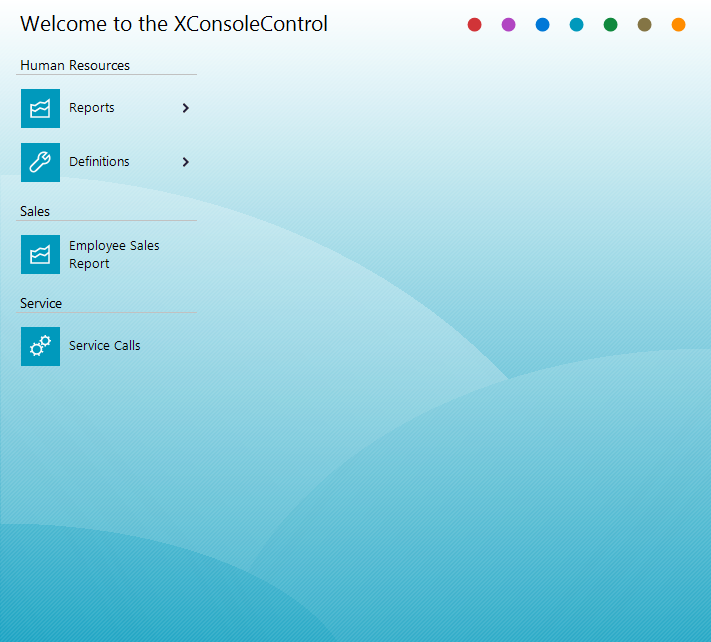 Example of a CommandBar
The CommandBar of the StartPage contains an optional title and a set of services the application can perform. The services are implemented using the CommandBarButtons collection. The buttons can be arranged into groups (ButtonGroups). A CommandBarButton can point to a subset of buttons.
InfoView
 Example of an InfoView
The InfoView of the AccountPage allows a flexible visualization of the detail information of the currently selected object. With the InfoViewTabs collection different tabs can be defined in order to better organize the details. The content of the view is implemented using the InfoViewRows and the InfoViewCells collection. Each row can contain one ore more cells. Each cell comes with a caption, an image, a free text and a footer. If the Selectable property of a cell is set to True, an event is fired when clicking the cell Furthermore the Text property of the cell can be edited if the Editable property is set to True.
DataView
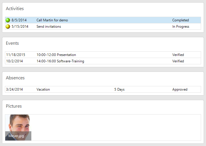 Example of a DataView
The DataView of the AccountPage provides access to the related information of the currently selected account. The view can be divided into sections using the RelatedDataItems collection. The view can also display pictures and multi-line text and the rows can be sorted in ascending/descending order. By clicking the 'visible' button on the right side of the toolbar, the user can at any time show/hide the data to display. The DataView comes with three views: Summary, Timeline and Chart.
DateNavigationBar
 The DateNavigationBar with the expanded date navigator
The DateNavigationBar of the CalendarPate allows the user to select a range of days.
CalendarView
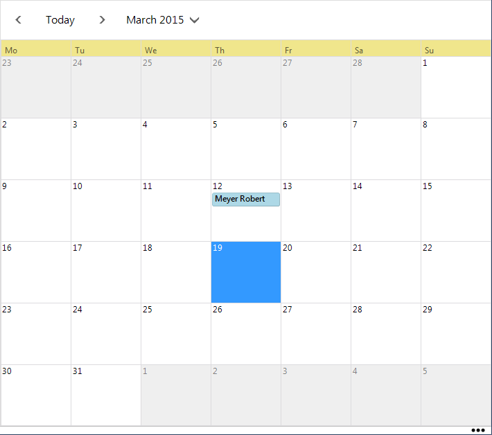 The month view of the CalendarView
The view displays the appointments and events of the currently selected resource. The CalendarView comes with day, multiple day, week and month view.
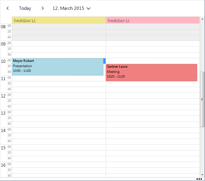 Multiple calendars in day view
It is also possible to display multiple calendars. Click the 'setting' button on the right side of the tool bar and choose Multiple Calendars. Click the 'panel' button in the CaptionBar and select the resource to display. By default, the resources appear side by side, but they can also be grouped by dates.